Shapes of Survival: Visualising Australia’s Threatened Animal Species
Shapes of Survival is a visual series exploring Australia’s threatened fauna through organic forms, symbolic mark-making and infographic design.
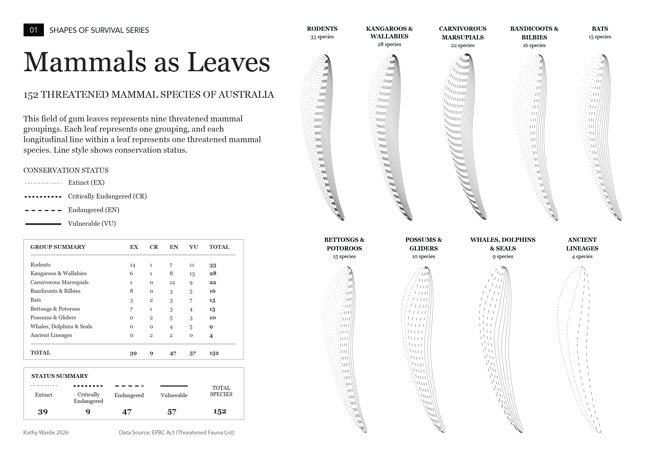
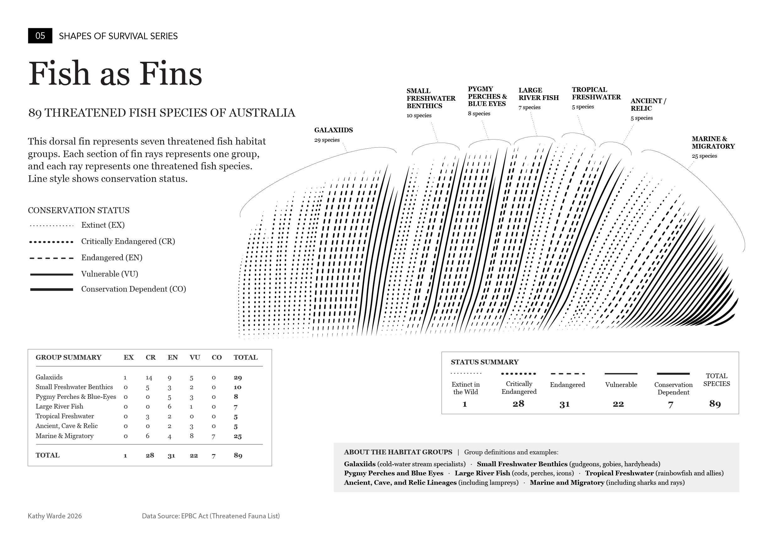
The project translates EPBC-listed threatened species data into a simple visual system: one line represents one threatened species, and the style of that line shows its conservation status.
Instead of presenting biodiversity loss as a conventional chart, the series uses forms from nature, including leaves, feathers, fins, ripples, tails, and delicate invertebrate structures, to make dense species data easier to see, compare and remember.
The aim is to create a bridge between data, art and feeling: a way to understand threatened species not only as numbers, but as patterns of absence, pressure and survival.


The visual system
Each infographic in the series follows the same core rule: one line represents one EPBC-listed threatened species. The line style is used to show conservation status:
Extinct = faint dotted line
Critically Endangered = larger dotted line
Endangered = dashed line
Vulnerable = continuous line
Conservation Dependent = stronger continuous line
This system gives the series consistency, while allowing each animal group to take on its own visual form.
Grouping the species
The EPBC threatened fauna list provides species names and conservation statuses. To make long datasets easier to read visually, some species have been reorganised into functional, ecological or design-oriented sub-groupings. The aim isn’t to create a formal taxonomy, but to build visually legible groupings grounded in ecological, anatomical or behavioural similarity. These groupings help reveal patterns across large animal groups without asking viewers to read every species name at once.
Data and interpretation
This series is based on threatened fauna listed under Australia’s Environment Protection and Biodiversity Conservation Act 1999 (EPBC Act). The artworks are interpretive rather than exhaustive scientific references. They are designed to communicate pattern, scale and emotional impact, while encouraging closer attention to the species behind the data. For detailed conservation information, refer to official government species profiles, recovery plans and conservation advice.
Why it matters
Threatened-species lists are essential, but they are not always easy to feel. Shapes of Survival turns long species lists into visual forms that feel alive, fragile and connected - part infographic, part field journal, part data artwork.
Sources
This series draws on publicly available threatened-species information, including:
EPBC Act List of Threatened Fauna - the primary source for species names, animal groups and conservation status categories used in the visualisations.
Australian Government species profiles, recovery plans and conservation advice - used to check species context where needed.
Atlas of Living Australia - used as a supporting reference for species information, taxonomy and distribution context.
The visual groupings used in this project are interpretive. They are designed for visual clarity and pattern recognition, not as formal taxonomic classifications.